Table of Contents
Context: Some Internet-based firms have been tricking users into agreeing to certain conditions or clicking a few links through “dark patterns,” also known as “deceptive patterns.”
Background of Dark Patterns
- These users would not have accepted such terms or clicked URLs (uniform resource locator), if not for the deceptive tactics used by tech firms.
- Such acceptances and clicks have resulted in arrival of promotional emails that users never wanted, making it hard to unsubscribe or request deletion.
What are Dark Patterns?
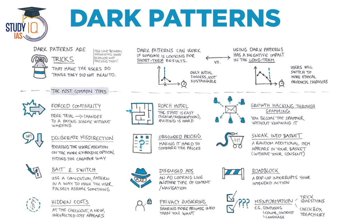
- Dark Patterns are carefully crafted interface designs that deliberately make individual’s Internet experience harder or even exploit them.
- They in turn benefit the company or platform employing the designs.
- Dark Patterns are used by digital platforms to take away a user’s right to full information about the services they are using, and reduce their control over their browsing experience.
- Origin: The origin of the term is credited to UI/UX (user interface/user experience) researcher and designer Harry Brignull.
Dark Pattern Tactics
- Baseless countdowns for online deals
- Terms and conditions in fine print that add on to costs
- Making cancellation buttons hard to see or click
- Making sponsored ads appear as news reports or celebrity endorsements
- Auto-playing videos on sites
- Forcing users to create accounts to finish a particular transaction
- Silently charging credit cards after end of free trial
- Using dull colours to hide information that users should be aware
Use of Dark Patterns
- Big Techs such as Apple, Amazon, Skype, Facebook, LinkedIn, Microsoft, and Google have been using dark patterns to downgrade the user experience to their advantage.
- Example 1: Amazon has attracted criticism in EU for its confusing, multi-step cancellation process for the Amazon Prime subscription.
- Later, it was forced to make its cancellation process easier for online customers in European countries.
- Example 2: LinkedIn users often receive unwanted, sponsored messages from influencers. Disabling this option is a complex process that needs users to be familiar with the platform controls.
- Example 3: In order to popularise their own video creating platform, Instagram was showing users posts they did not wish to see and that they were unable to permanently set preferences.
- Sponsored video ads are being sandwiched between reels and stories that users originally opted to view.
- Example 4: YouTube nudges users to opt for YouTube Premium with pop-ups, obscuring the final seconds of a video with thumbnails of other videos.
- Example 5: Amazon launching a supposedly ‘free’ children’s app that fooled its young users into making in-app purchases that their parents had to pay for.
Impact of Dark Patterns on Users
- Exploitation: Dark Patterns endanger the user experience and make them more vulnerable to financial and data exploitation by Big Tech firms.
- Time consuming: Dark Patterns confuse users by introducing online obstacles that make simple tasks time-consuming.
- Other impacts: Dark Patterns make users sign up for unwanted services, and force them to pay more money or share additional personal information than they intended.


 Pakistan-Occupied Kashmir (PoK): History...
 List of Indo-Pakistan Wars and Conflicts...
 Daily Quiz 24 April 2025


